UI/UX Case Study
Angelica Hernandez
Julia Santana
Marissa Newman
The Problem
Almost half of individuals find that:
1. They are not always well-informed about disastrous events.
2. When they do get the information they need, the majority of users get news from social media apps.
3. Users can’t find an easy or reliable way to help or donate to these events.
The Solution
To create a mobile application that notifies users with up-to-date, truthful and honest information in order to keep themselves and their families safe. The app will also make it easy to share and donate to these events in order to bring awareness to causes the users care about.
Process
Logo
User Research
User Insight
Affinity Diagram
User Persona
User Flow
Lo-Fi Prototype
Hi-Fi Prototype
Style Guide
Fuse
We chose to name our app after an electrical safety device because this device is designed to protect the circuit in the case of an emergency. This is very similar to what our app will do, help and prepare people in the event of a natural disaster.
Hi-Fi Prototype
This is the high-fi prototype. View app Fuse App Prototype
View promotional website Fuse Promo Page
Style Guide
“In 2018, natural disasters affected over 68 million people”
User Research
We conducted an online survey with 50 respondents.
Key user insight
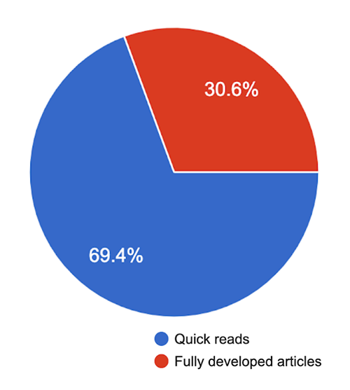
Almost 70% of the people we surveyed would prefer short articles that give the headlines verses reading full articles. This means that our app needs to have the headlines with a quick synopsis with a link to the full article if the user wants to know more.
Key user insight 2
63% of people would donate to a natural disaster if they trusted the source, and another 30% might donate. If people are better informed they are more willing to donate to the cause.
Affinity Diagram
user persona
User flow
1. To share an article they found on our app.
2. The type of notifications a user would like when they download the app.
3. Is if they open the article on a laptop or without the app and it suggests to download the app.


